2026 Design Trends.
We see trends come and go, and I think as the trend cycle gets shorter and shorter, maybe we’re just sick and tired of trying to follow the next big thing. Maybe we just want to be nostalgic for once and go back to basics.
Well, I feel like 2026 might just be the year of nostalgia, so here we have, my take, of design trends for this year, and maybe just take that, with a tiny pinch of salt!
The Resurgence of 2016
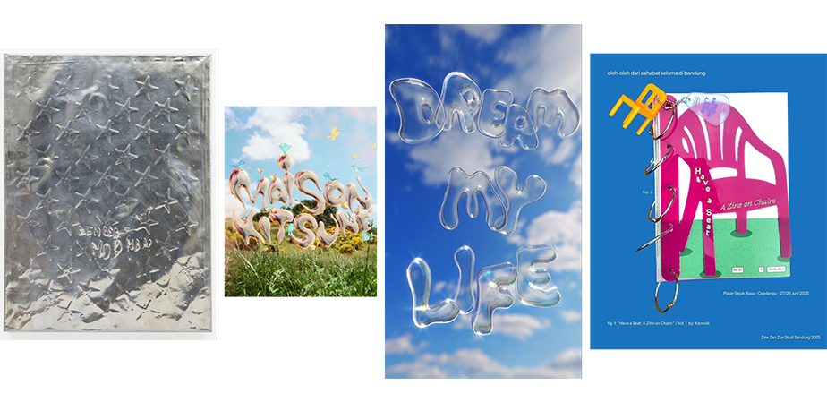
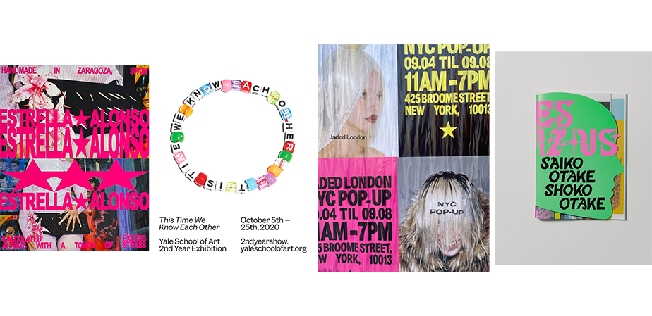
We’re only just into the new year and we’ve seen this trend come out in many different ways already. From our favourite snapchat filters to the rio janeiro instagram fury, we’ve started the year nostalgic and it’s here to stay. We’re over minimalism and AI Generated anything is already rubbing people up the wrong way. Let's re-introduce the bold colours, natural textures, illustrations and typography.
Western/Cowboy/Equestrian
Hey, it’s the year of the horse. I feel like with this in mind we’ll see a bit more of that raw and rough Western style coming through. This could be through textured design, lots of off-white, burgundy reds and hand drawn designs, not to mention Western Style fonts, and also stars!

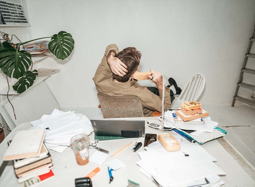
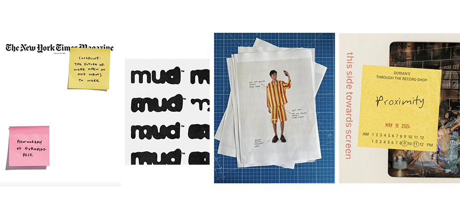
Messy Vibe Old Stuff
Bringing ‘real-life’ elements into design. From stickers to scan-ins, papers to post-its. Blending these ‘man-made’ items with design makes things feel less produced and more personal. With the rise of AI, we just want to see a touch of humanity in there somewhere. So if we see some hand-drawn scribbles, a scanned in, screwed up paper, or some overlapping, off-centre text, we’ll be happy.
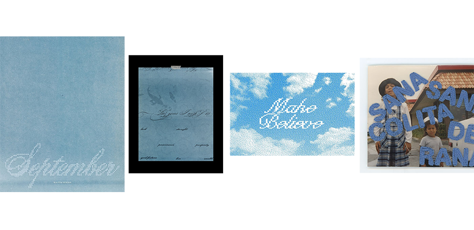
The Colour Blue in Nature
Forget Cloud Dancer, Blue is back! Blue in any shape, form or shade and to be honest, we’re all craving the calm. Everyone knows blue’s the colour of calmness so we’re pulling it back from behind the beige. I think this will manifest itself a lot in all things blue in nature, the sky specifically.
Frutiger Aqua
Linking on with the blue, Zara Larssons, Midnight Sun has given us the flashback of a life when Frutiger Aqua was rampant. Over saturation and a burst of summer life and warmth really is calling, so here we are, back, full circle, to the 2016 over saturation of colour. I think in 2026 we’re a lot more mindful and just a bit more understanding of the fact that too much saturation can be blinding, but bringing back the colour is never a bad thing!